

Themes
A theme is a named set of colors. Each comes in a light and a dark color
scheme, and you choose the two separately in Settings → Appearance, where
the theme gallery previews each one, or from
the command palette (type “Theme”). The choice is kept in this browser and
applies before the page draws. An operator picks the theme a new browser
starts with (THEME_DEFAULT_PALETTE). A browser that never chose one follows
that default, including when the operator changes it.
Every theme is held to the same bar: AA contrast for all text and AAA for body text, visible borders and focus, and status colors and chart series that stay apart for readers with a color-vision deficiency. The rules and how they are measured are on Theming.
How to choose
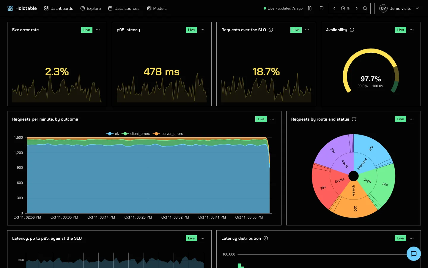
Section titled “How to choose”- Holotable if you have no reason to change. It is the default.
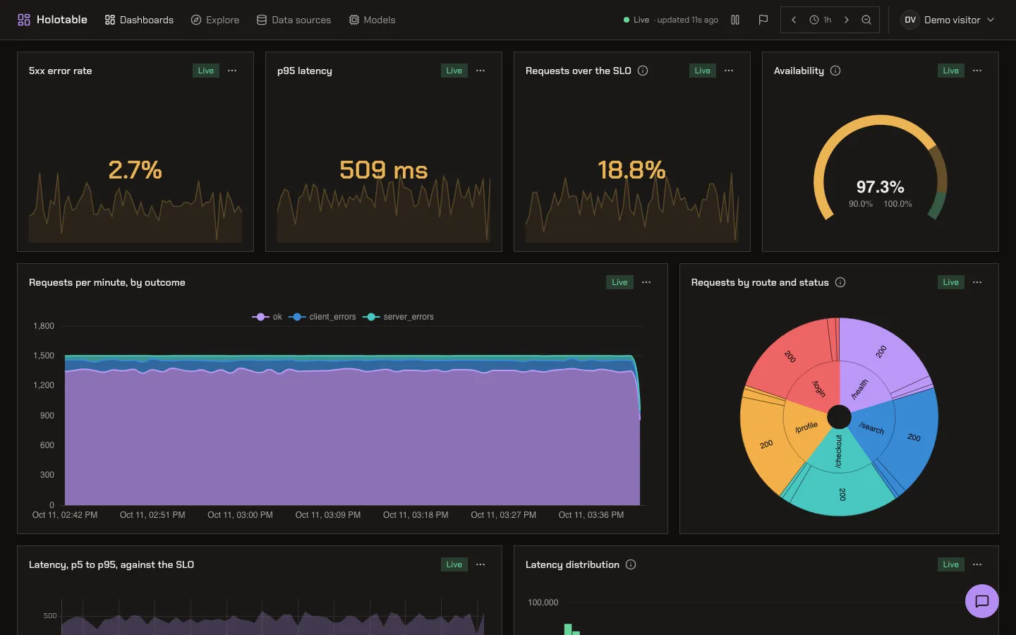
- Graphite if the blue feels cold, or a wall of panels should show only the data in color.
- Fjord for long sessions, when you want the page calm without losing contrast.
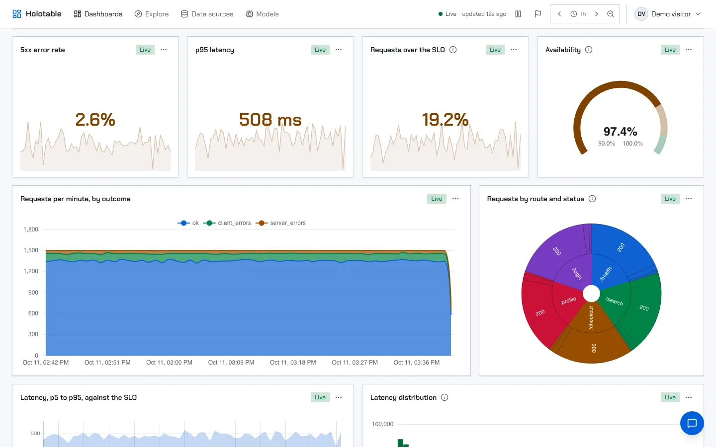
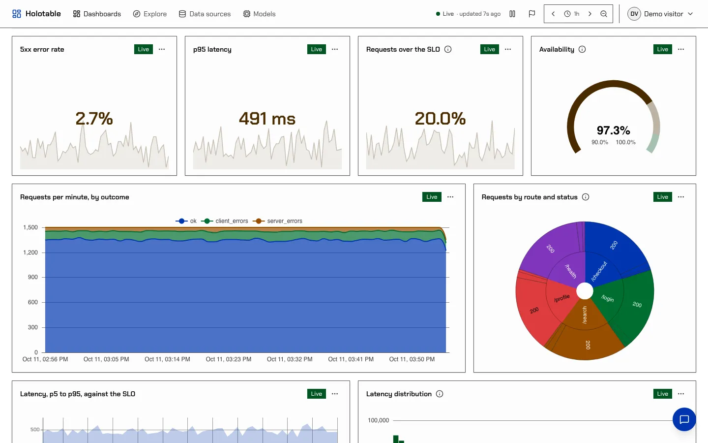
- Paper for a projector, a printout, or anyone who reads a dashboard like a report.
- High contrast if AA is not enough for you, or the room is bright.
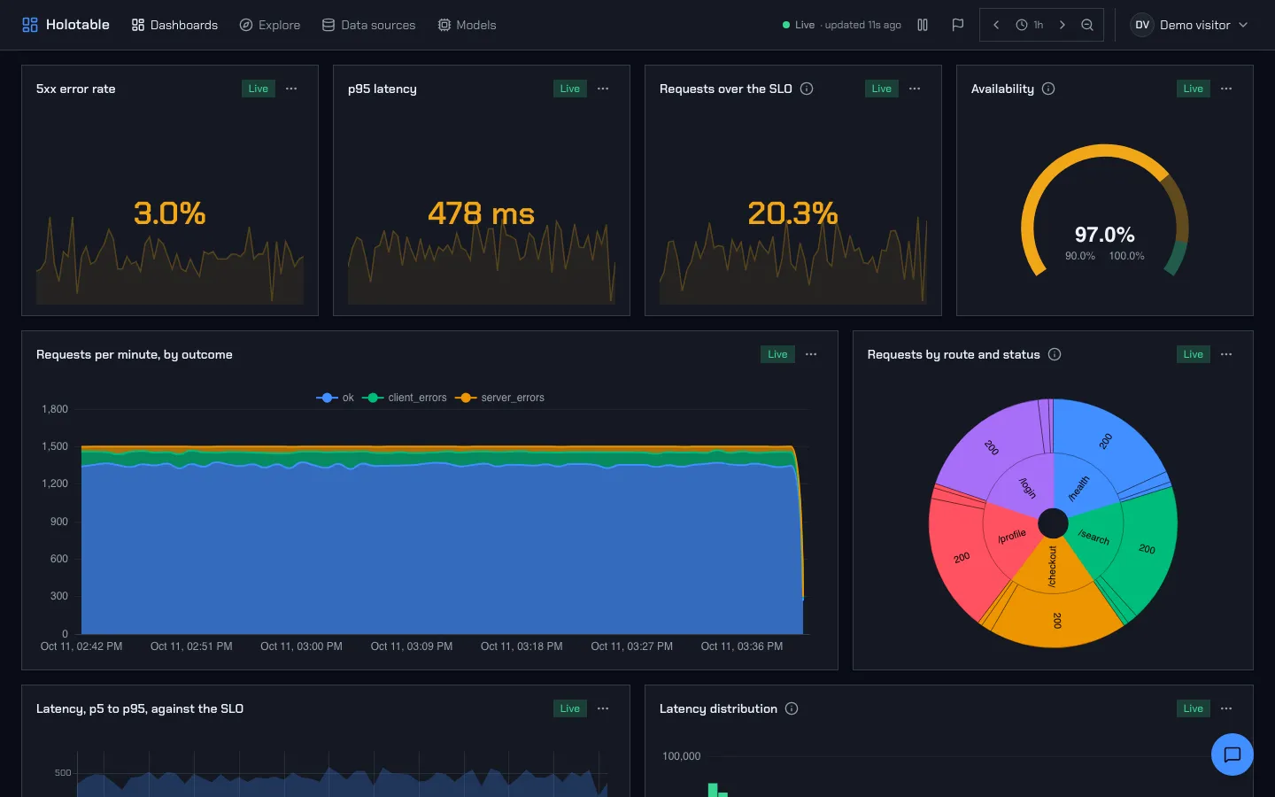
Holotable
Section titled “Holotable”Cool slate surfaces with a blue accent. Its statuses and eight chart series are the reference the other themes are measured against.
Graphite
Section titled “Graphite”A true neutral. The surfaces are warm grays with almost no color, so a chart is the only colorful thing on the page. The accent is violet, chosen because it is far from every status hue: a link or a selected tab is never mistaken for a warning. Statuses are a little quieter than Holotable’s so they sit in a neutral page. The chart palette leads with the accent, then blue, teal and amber.
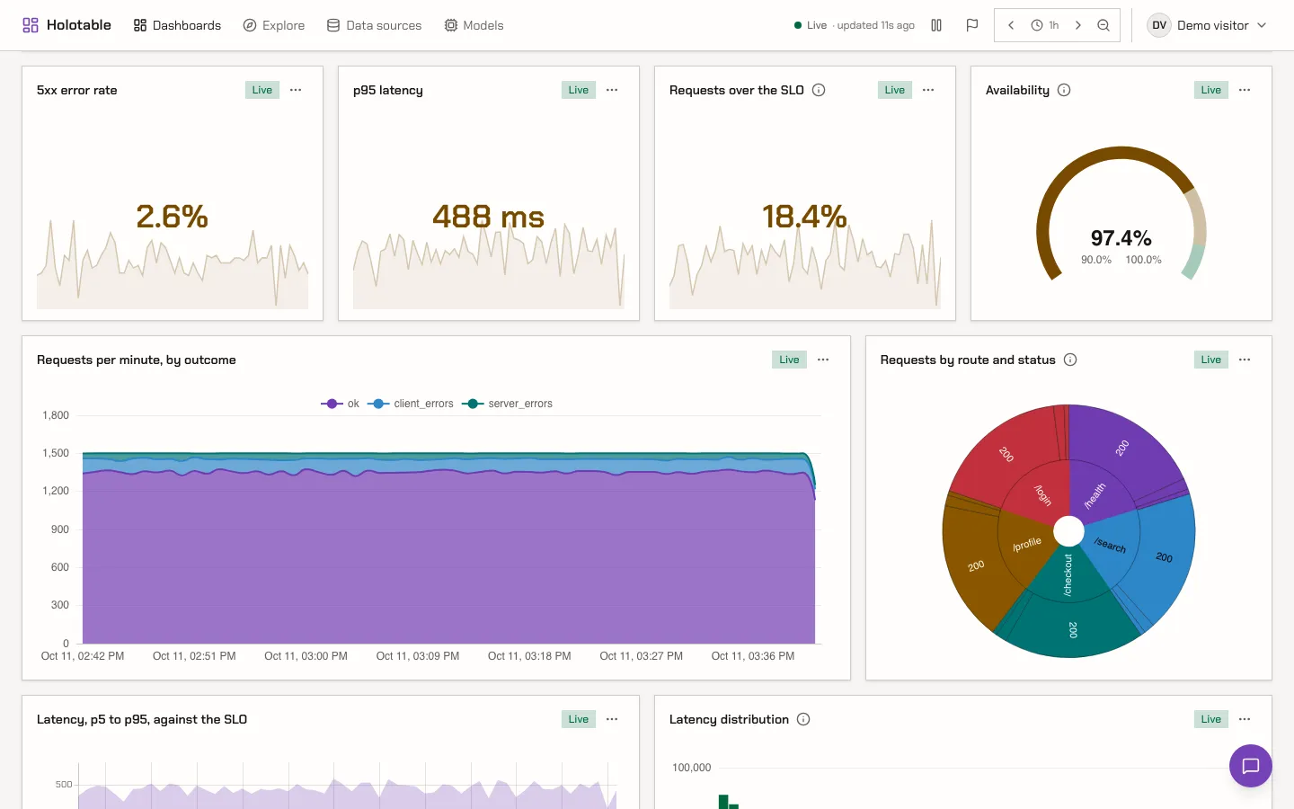
Cool and calm without being low in contrast. The surfaces are tinted blue-green and the accent is a sea teal. Secondary text is a shade warmer than the surfaces, so it reads as ink rather than fog. The chart palette comes from the sea side of the color wheel, with an amber and a coral series for contrast. Amber comes second, so the first two series never share a hue family. Success leans yellow-green so it stays well apart from the teal accent. The light scheme is a pale mist, not white.
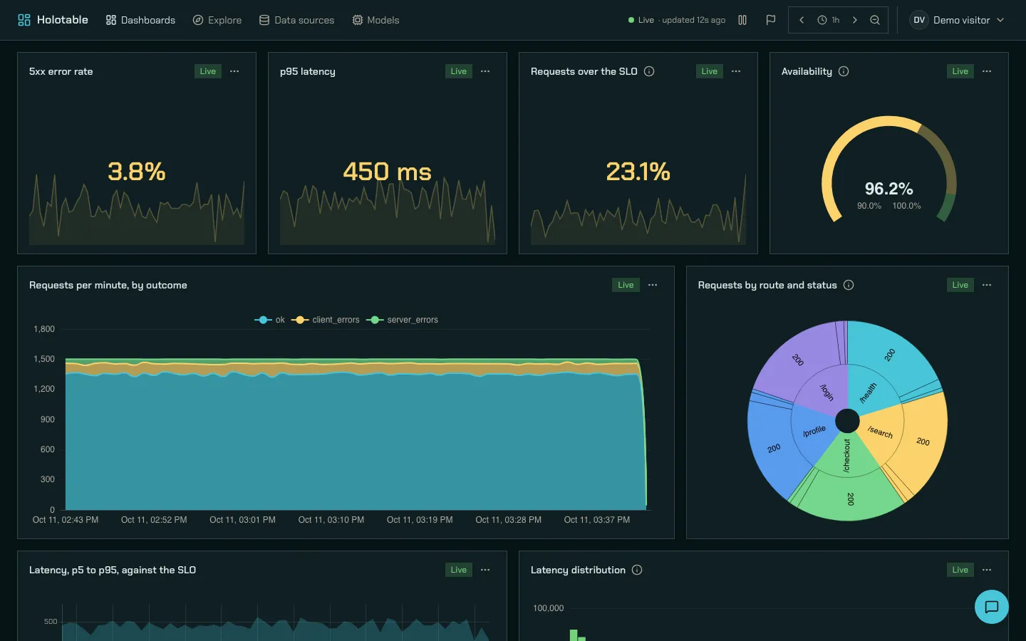
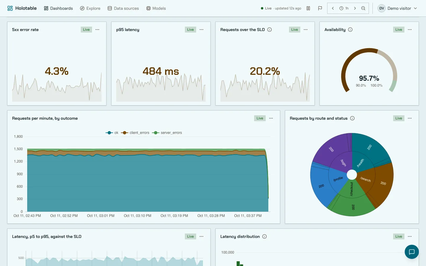
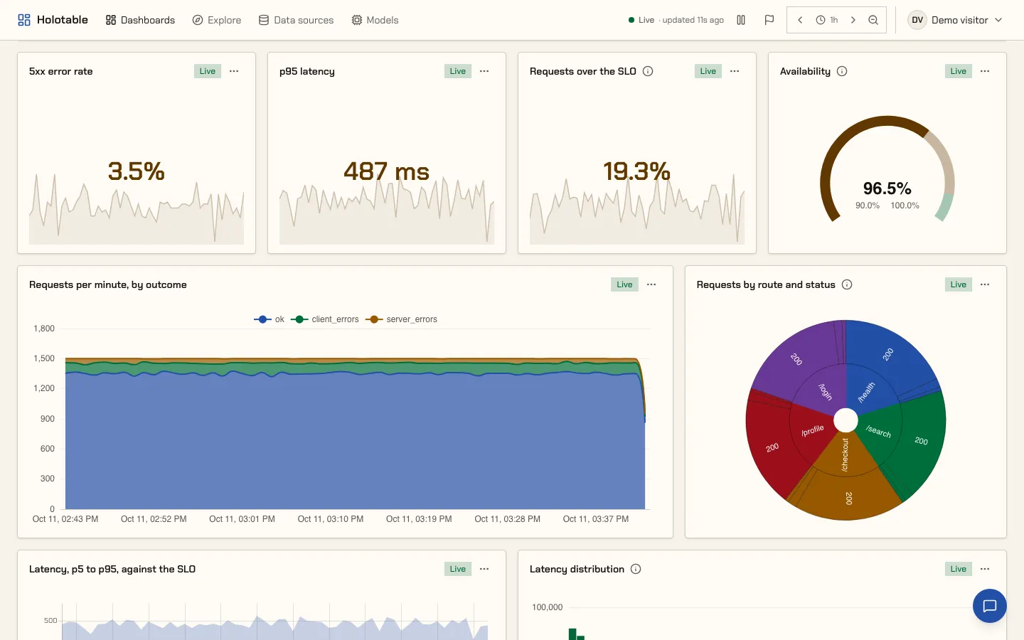
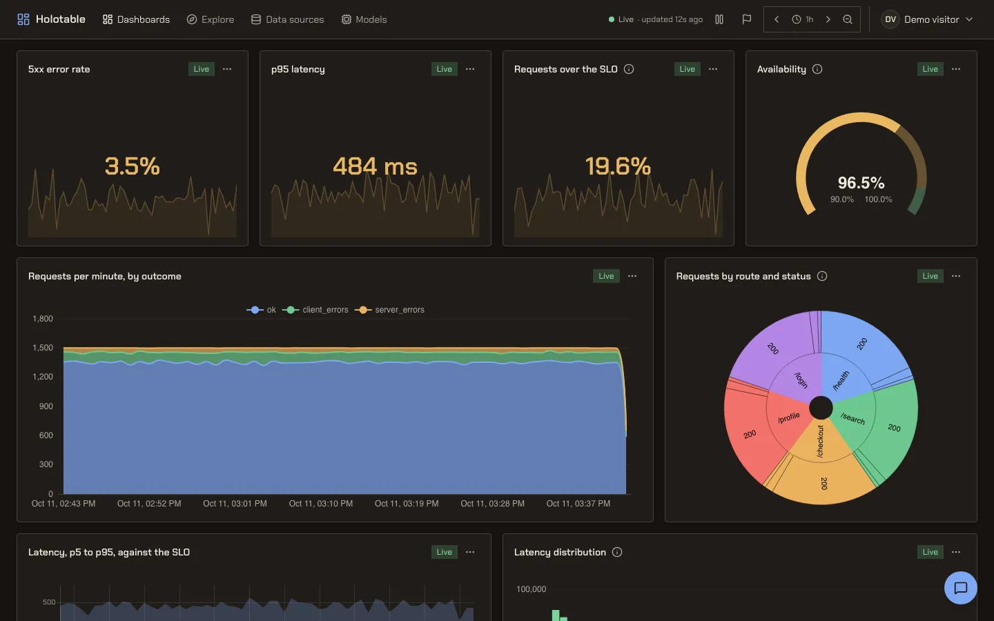
Light first. Ivory surfaces, near-black ink and a deep blue accent, with chart colors inked slightly darker than the other themes so thin lines hold on a light page. It is the one theme with rounded corners. Its dark scheme is a warm charcoal, not an inversion of the light one.
High contrast
Section titled “High contrast”For people who need more than AA. Every text is at least 7:1 against what it sits on, and body text is at least 12:1. Borders are at least 4.5:1, and the background and cards are nearly one color, so edges carry the structure rather than shades. Badges, alerts and status tiles are solid fills instead of tints. Chart series are spread across lightness as well as hue, the grid is visible, and the marks behind a value (a stat’s sparkline, a gauge’s threshold bands) are drawn stronger. Its bar is stricter than the other themes’, and it is described on Theming.
Your operating system’s colors
Section titled “Your operating system’s colors”If your operating system forces its own colors (Windows High Contrast, also called contrast themes), it overrides every theme. Holotable keeps edges and focus visible in that mode. It also redraws charts in the system’s colors, because the system cannot recolor a chart itself.